


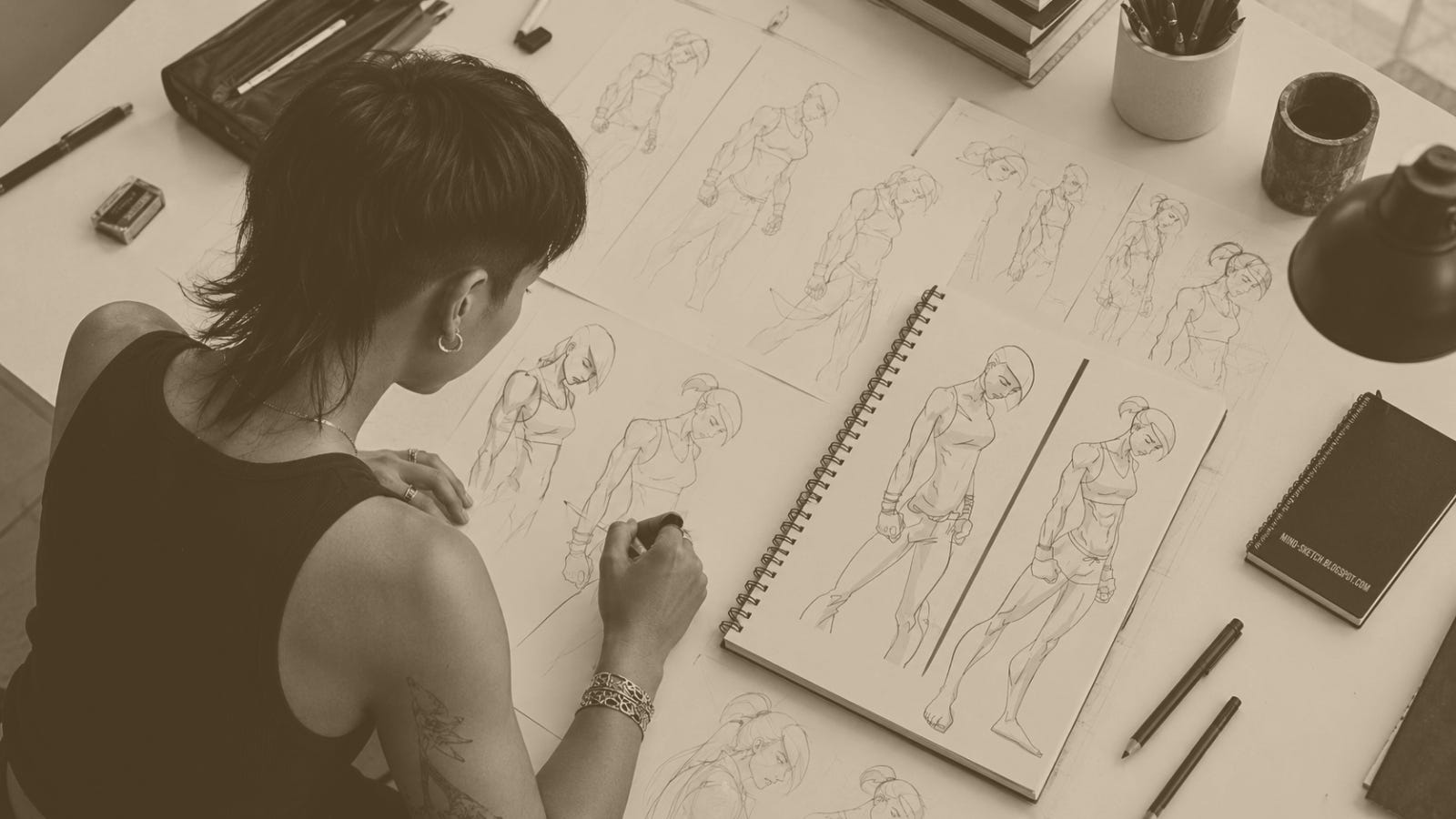
Fifteen years ago, my business partner, Kirk Dewaele, and I set out to build a concept for former athletes and high performers. People who operated outside the bell curve. We eventually called it MADabolic.
But the idea behind MADabolic was never really about us.
It was always about her.
Long before there was a gym, a franchise, or even members, there was an untapped whitespace in the market. She became its physical expression.
People often described the original MADabolic logo as inspirational.
Close, but not quite.
She wasn’t meant to be inspirational. She was meant to be aspirational.
There is a difference.
Inspirational says, “Come as you are. You are supported.”
Aspirational asks, “Who are you? What do you stand for?”
That distinction shaped nearly every decision we made as founders.
This image represented the mindset of an outlier, rooted in strength.
Strength wasn’t just physical. Strong was beautiful. Strong was disciplined. Strong was empowering. Strong was something to stand for.
That’s who she represented.
Not a customer. Not a demographic. Not even a type of fitness enthusiast.
She was a belief system long before she was ever a logo.
She was our muse.
The Story Behind Her
I can still remember my internal monologue.
Not the finished logo. A very specific look I couldn’t get out of my head. Quiet confidence. Strength without arrogance. Beauty without an audience. Subtle. Edgy. Powerful in a way that didn’t need to announce itself.
I wasn’t just searching for artwork as an example. I was searching for someone who could visualize an idea I couldn’t yet explain.
After countless Google searches and combinations of words, I eventually stumbled across the blog of a nineteen year old art student in San Diego.
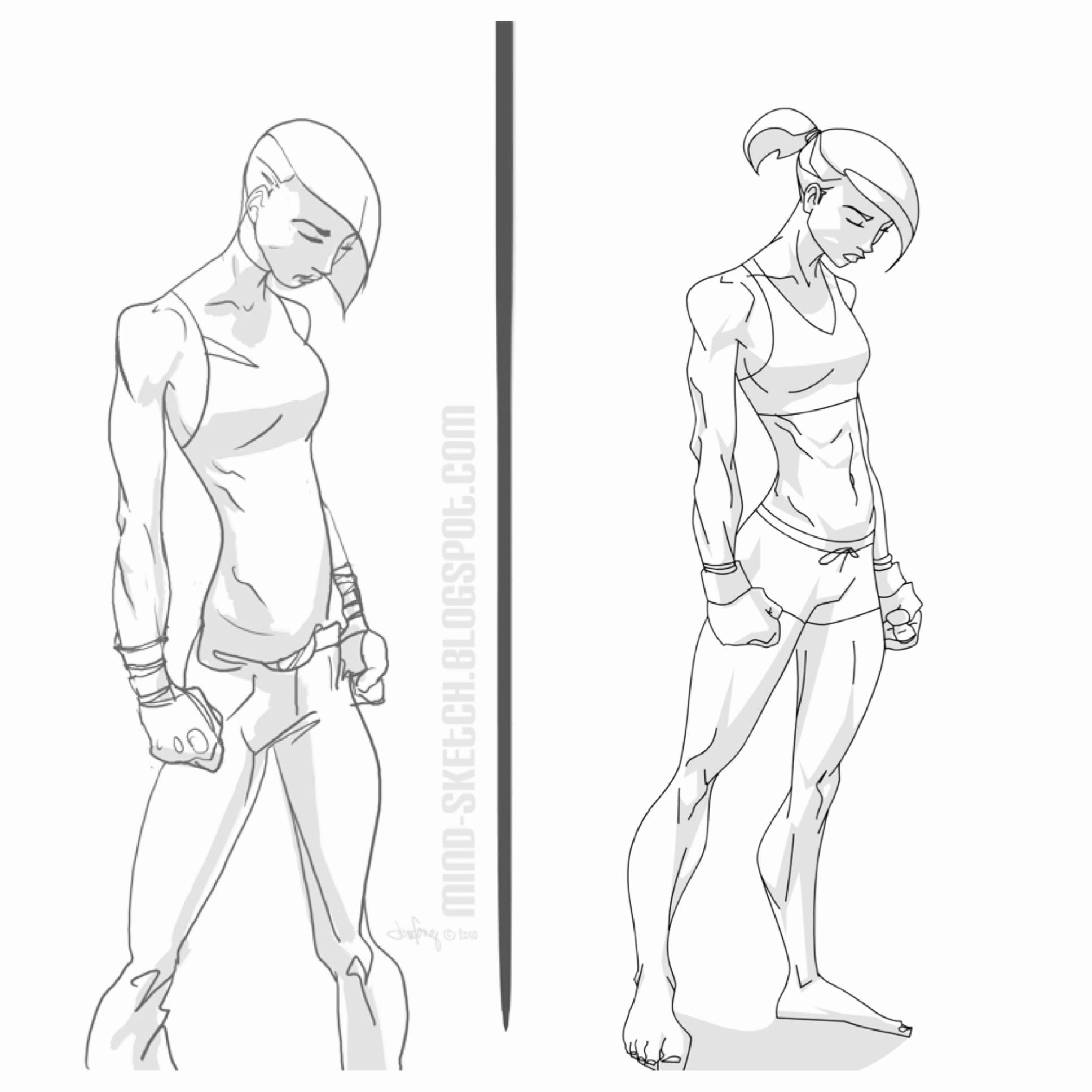
Her name was Jennifer Fong. Her blog was called Mind Sketch.
It was more than artwork. Every illustration carried its own personality. They felt like stories frozen in a single frame.
One illustration immediately stopped me.
It was called Fighter.
The moment I saw it, I knew I had found her.
Not because she was finished.
Because she already embodied everything I believed MADabolic could become.
On our first phone call, I explained the concept, the personality, and the image that had been stuck in my head for weeks. It felt like she already understood.
Together, we adapted her original illustration into what would eventually become the face of MADabolic.
When the work was finished, I sat down with my friend and cofounder, Kirk Dewaele.
I wasn’t presenting a logo. I was presenting an idea. I was presenting our future.
Thankfully, with Kirk’s unwavering belief and support, he saw the same vision I did.
MADabolic was born.
Culture Rich Brands Don’t Chase Everyone
One of the biggest misconceptions in business is that great brands try to appeal to everyone.
They don’t.
In fact, culture rich brands do the opposite.
Take our logo, our muse.
She wasn’t designed to represent everyone. She wasn’t even designed to represent women.
She was an outlier that represented a standard. A mindset.
She was the visual expression of a belief system.
Culture rich brands build an ecosystem that naturally attracts one person while intentionally repelling another.
MADabolic was no different.
The goal was never inspiration or to create mass appeal.
MADabolic was built to reach people who operate outside the bell curve.
The truth is, when you try to appeal to everyone, you eventually identify with no one.
Our Hope
One week ago marked the end of an era. Fifteen years alongside my cofounder.
As new leadership takes the company in its own direction, I sincerely hope she is not forgotten.
Not because of nostalgia and not because she belongs to us.
Because she represents an idea that always mattered far more than either of us.
Every brand eventually reaches a point where scale begins asking it to compromise. The question is whether leadership answers yes.
Our biggest fear is what that next wave of scale might prompt.
Brand dilution is almost never one catastrophic decision.
It’s death by a thousand compromises.
One exception. One accommodation. One attempt to become just a little more appealing to everyone.
Until one day, the brand no longer remembers who it was built for.
In our case, who she was.
Because this was never really the story of a logo.
It was the story of a belief system.
She just happened to give that belief system a face.
Brandon Cullen
In search of life’s [im]perfect soundtrack ...
Respect 🖤❤️🔥🖤
Amazing Brandon.
I fondly remember her and what she stood for.